Web Design circa 1996
Today, while searching for a topic to blog about I came across an old website. For those who are "digital immigrants", or are "digital natives" (Crook, 2012) that happen to be born during the time when the field was burgeoning, can truly appreciate the development that occurred in the last two decades.
This post will show how the web infrastructure and design has evolved from web 1.0 to 2.0.

This post will show how the web infrastructure and design has evolved from web 1.0 to 2.0.

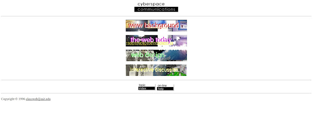
This was taken from a MIT class on cyberspace communications in 1996. Upon entering the page, the first thing that struck me was the level of "design" that the page had. Poor use of white space, poor word-background contrast, and (over)use of colour in attempt to grab attention. But I could imagine that this was fashionable at the time. Upon further exploring of the site, I also realised the type of interaction, or lack thereof, with the site. It was at best, a repository of data that you access to read. The links were embedded in simple buttons that allowed you to navigate the site. And of course, you can compare it to the site of today. Granted the class would have evolved as much as the technology, but an interesting comparison nevertheless.

Josh, out.

I was a corporate webmaster in the mid-1990s. I remember when being able to do a layout like that was super novel and cool!
ReplyDeleteOh, and the first online class I ever encountered (around that time) had a prof who posted lecture notes online and students discussed via listserv, turned in assignments via email. (In those days attaching a file was a sophisticated affair because you had to upload the file to a server first using an FTP program. Oh man, no one talks about FTP anymore!
I think most of the sites of that era are now what the Neilsen Norman Group defines as bad usability experience. They showcased poorly contrasting colors (text and background), distracting animations, and an undefinable hierarchy of content. But then again, these mistakes helped build a system to support an end-user's perspective for better design that makes navigating sites easy and engaging. Now that I think about it, I do vaguely remember singing animated lemmings being on a website or two as well...was that possible?
ReplyDelete